50 Shades of Green: Battlefront Colours of War book
By Paolo Paglianti
Images courtesy BattleFront
Whatever you play sci-fi Warhammer 28mm games or 15mm historical ones, half of our hobby is painting miniatures. If you are like me, you have tons of unpainted metal and plastic miniatures in the hobby room. Those Orks you bought because that fantasy soccer was so good. The space marines you collected because sooner or later you’ll do that WH40K army. And obviously boxes of WW2 tanks and Alexander phalanxes in 15mm.
Something that can’t miss in the wargamer’s shelf is a book about painting techniques. Before the Internet, they were precious as gold. Although you can now find plenty of online written and video tutorials, a good colour reference book is still quite useful.
In my painting “career” I have read books from Games Workshop and the awesome , but Battlefront’s is something unique, because it’s one of the few (actually the only one, as far as I know) totally focused on 15 mm armies. As one of the best and most inspiring lines in the book, it would be crazy to paint a full Russian 15mm WW2 army with the same definition as a 54 or even a 28 mm miniature. Colours of War is totally aimed for your twentieth century armies.
A book to begin with
If you have ever opened a FOW / Team Yankee army book, you have a good idea of what you can find here. The last pages of any army book are devoted to “how to paint your new British/German/Italian/etc army”. Colours of War expand this idea, embracing (almost) all armies in Battlefront’s range.
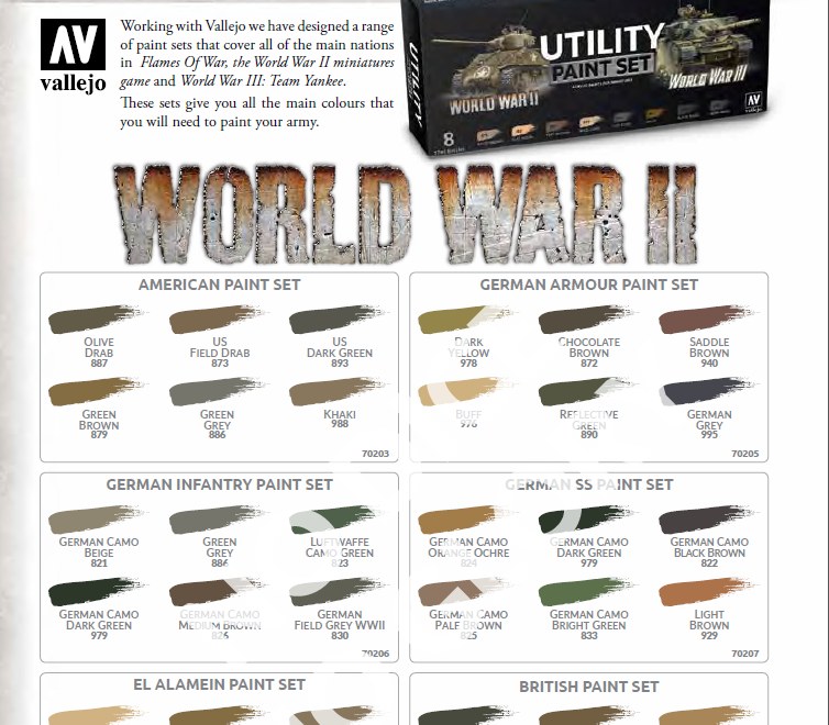
Taking the opportunity of the just-launched relation with Vallejo range of colours, Battlefront revamped the book published back in 2015. In the new Colours of War book, all colour references are in Vallejo standard colours instead of the Games workshop-like names from the old Battlefront lines of colours. So, time to say “bye bye” to names like Tankovy Green or Comrade Khaki, and “welcome” to the familiar Vallejo names Yellow Green or Iraqui Sand that you can easily find in any hobby model shop around the world.
First, the basics
The first 30 pages focus on general advice: which tools you need, how to assemble a plastic model, the value of a good undercoat before painting, how to prepare and mount a full platoon 15mm soldiers on some stands to paint them quicker. There is also a solid section on colour theory: the shades, the light, some advanced techniques like layering and obviously the unmissable washes and dry brushing. This part is good for beginners, but it’s a good reading also for experienced painters. I remember I understood the glazes thanks to a Games Workshop Space Marine painting book, years after I began to paint.
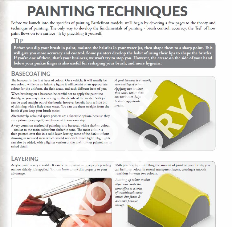
At the end of these 30 pages, there is a “put it into practice” page with a German Grenadier painted from the basecoat to the finest details. Also, some good advice on basing, from the snow/winter bases to the desert ones, using the special “themed bases” sold by Battlefront, and various “Common features” pages: how to paint a face, for example. That is good both if you paint a German WW2 army or a British Team Yankee one.
As I said before, the focus here is to maximize the efforts for a 15mm miniature. The “basic” face is achieved in three fast passages, and the “Advanced one” in six – but it’s still done for a 15mm miniature you will see on the tabletop from half a meter while you’ll play.
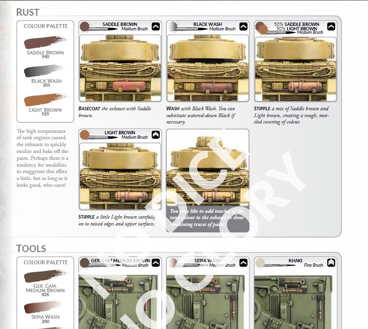
The same common area gives good advice for vehicles: tracks, tires, the rusty parts of the exposed engines. For example, if you look for a video on Youtube on how to do some rust on a tank, you’ll probably find a long tutorial with expensive special paints. That technique will be fairly good for 1:35 tanks, but totally wasted on 15mm. In Colours of War, it’s done in five steps, using just three colours, and the effect is just great for our scale.
Time to paint the army
After the section on general ideas, time to focus on the diverse armies. Colours of War starts from WW2 armies: you can find the US, British, German, Russian and Italian sections. If you already have the related army book, you’ll find almost the same material plus (usually) tons of new information.
On the average, a nation section on Colours of War is at least twice in pages compared to the “how to colour” section on the same army list book. For example, under the US chapter, you’ll see five pages on Mid and Late tank insignia, where they were placed, the nicknames on the Shermans and the position of the US Flags on the M3 Half Tracks. Although this is info you can find relatively easily on the Internet, it’s ready to use in the book and grouped together with the appropriate army painting information.
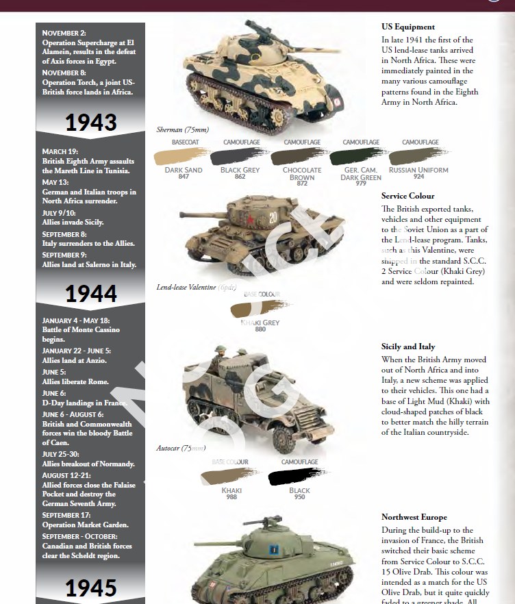
For Germans, it’s tank galore: there is a special “column” about the different camo styles from ’39 to ’45, and you can learn that late tanks were painted in a simplified pattern due to colour shortage, for example. The 20 pages on German armies are a summation of the three Mid-War books, with more on Late-War colours. The same for the British, with their camo evolution from the early war BEF colours to the various desert patterns, and finally to the Late-War greenish. For His Majesty’s troops, there are also a couple of pages on insignias, with explanations on where they serve, Infantry markings, and how they were used in the divisional service.
One of the only downsides to the book is the Italian section. It was a bit disappointing since it is almost identical to the painting guide in the Avanti army book.
Cold War getting hot (and coloured!)
The final section is on Team Yankee’s armies. Here too the single nation’s sections are “expanded” versions from the related army books. For example, the US section improves with Desert Camo for the infantry, some advice for African-American faces and winter/desert camo for vehicles, with MERDC pattern for desert war.
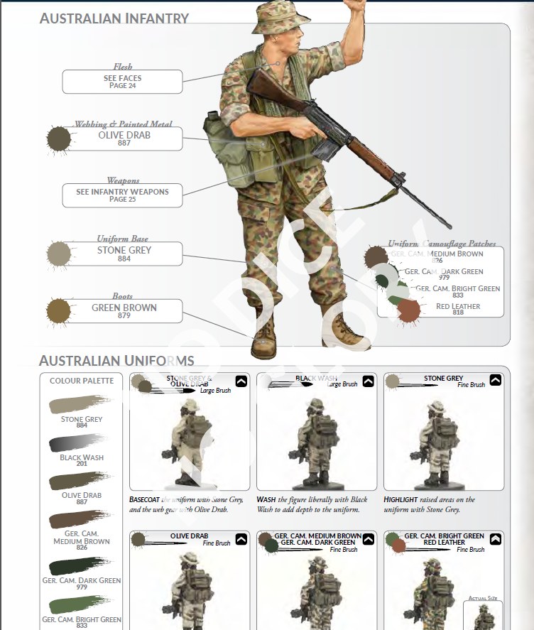
The British WW3 section has an “Australian” section for infantry and a couple of pages on how to position the markings on British vehicles – both of them not present in the colour section at the end of the Army Book. However, there is no section on Desert warfare and Oil Wars armies, alas, nor on Vietnam or Fate of Wars related. The WW3 part is a bit less expansive than the WW2 section, comparing to the army book sections, in general.
If you have the “old” Colour of War
If you already have the 2015 “old” Colours of War book, you may still want to consider the new version. Even though the first 80 pages are almost identical, the new version includes the Vallejo codes, replacing the “old” system ones. Unfortunately, as I noted above, the WW2 Italian section is missing in the original book. The new Colours of War includes the Italian section but offers nothing deeper than what you already have on Avanti army book.
In addition, the Team Yankee part is totally new to the Colours of War volume, so if you are interested in that part you may consider purchasing the book.
Final thoughts and what I’d like to see in the next “Colour” book
I think Colours of War is a very good book for beginners and medium level painters who want to improve their skills. As I said thru this review since Colours of War focuses on 15mm WW2/modern miniatures, it’s pretty unique on the shelves of “how to paint” books. It can really help to turn greenish or basic painted armies into much better-looking miniatures. If you never used washes or drybrush it’s an awesome starting point, but it also can help people with already decent and even good skills to get that “final” look on the small miniatures and vehicles.
Obviously, learning to paint miniatures today is much easier than back in the ’90s or early 2000s. One can get information and advice on painting thanks to the Internet and the tons of free tutorials you can find on Youtube, so these books are no more so badly needed for the apprentice. However, it’s also good to have all the basic and most important “things” in one book.
Many of us don’t have only a single army or add allied troops to our main force, so it’s useful to have a reference for multiple armies together in one place. Colours of War is also totally worthwhile for those who are going to start to play FOW with the incoming Fortress Europe book. Fortress Europe doesn’t include any “how to paint” guides Late-War armies.
Room for a Sequel
Should Battlefront decide to add a second volume to the range, I’d really like to see some chapters on advanced techniques. In the last few years we’ve seen many new products for weathering the models like the new pigments, or for creating striking water, snow and mud effects, and to create much better bases for the infantry. Also, would be a nice idea to have some pages on airbrush and masking techniques. Both of these would be useful when painting large armies with camo made by stripes.
Meantime, Colours of War is a great addition to any beginner wargamer looking for some good reference and advice but could be a bit redundant if your level is higher.
Honest and worthwile evaluation. Thank you
Thanks a lot 🙂
Great review! by the way, what do they recommend as a base green color for Soviet ww2 tanks?
Thanks, Lukasz!
They suggest a base of Cam. Olive Green 894, black wash 201, then drybrush with Reflective Green 890. I’d add up a bit of yellow, to have a final lighter tone
Thanks! so they went to the old scheme, that may be accurate but indeed a bit dark for this scale.